The Consonance promise is:
to harmonise publishing businesses’ processes, by sharing our expertise through our app and all our communication, so our customers sell more books with less effort.
How do you communicate a desire to share knowledge and improve sales through colour, imagery, tone and design?
With difficulty, it turns out. We’ve been on an eight month journey, wrapped around the day-to-day running of the business. We wanted to find a way to communicate our message, and so we embarked on a rebranding exercise. However, we chose not to hire an agency, not least because the cost of an agency rebrand is not to be underestimated. In any case, as we dug deeper into what we were trying to achieve, it became clear that design has very little to do with, well, design.
First, we had to distill our message down to its bare essentials. The fuzziness that our early messaging displayed (‘Make businesses better!’ ‘Help publishers be efficient!’ ‘Encourage more effective data!’) meant it was too vague to be encapsulated by a logo, a typeface, a palette. The design process we needed was as much to hone our message and our intent as anything. I’m not sure that an agency could have done that hard, personal work for us, other than be expensive facilitators to make us ask and answer the right questions.
We used a number of tried and tested management devices to whittle our story and plan our strategy. The Business Model Canvas. The Customer Success movement. The all-customer survey. The rather dated, yet trustworthy, SWOTs and 7Ps and balanced scorecards. We got a great business plan out of all the work and varied approaches:
But one of the most compelling and relevant tools was to use Jungian archetypes. Stay with me…
Brand archetypes
Carl Jung said that there are a limited number of archetypes that reside in our collective subconsciousness. These archetypes are used wherever story is found, repeatedly through history. This is a particularly pleasing concept for a publisher to enjoy: try to think of a story that doesn’t have an Underdog, or a Jester, a Caretaker, Rebel, Sage, or Hero.
In their own way, brands are stories, too. Our own story is that over time we have worked to amass certain secret knowledge — programming, ONIX, how retailers work, the secret to hitting the publication date, how to get Amazon to index keywords — and our purpose is to enlighten publishers who seek to pursue efficiencies and achieve either enlightenment, or higher sales, or both. But we have to fight to get our knowledge out there, our foes the incumbent legacy players in the supply chain, who don’t want to have to innovate or change. Like Dumbledore, we are the Sage, tempered with a dash of Rebel to liberate us to speak plainly and call out complacency.
The Sage as a planning framework
The Sage/Rebel archetype provides the perfect shorthand to represent our message. It also provides a helpfully restrictive framework, because having less choice about tone and voice makes for clearer messaging. What font style should we adopt? Something Sage-like: solid and trustworthy, timeless and also contemporary enough to indicate that we are a software business as opposed to, say, a day spa. What tone of voice should we adopt in our documentation, articles and interface labels? One which projects Sage-like confidence, establishes authority, and communicates complex information clearly, without condescension and with the objective being to impart knowledge, not to crow or obfuscate. We’ve captured the details of how we achieve this tone in our style guide.
What sort of logo should we adopt? This is where our message had to be very clearly articulated before we could start. We want to communicate that we are a trusted partner, one which shares knowledge and provides insight and infrastructural capability through our app that help publishers grow. An upward trending line, coupled with that icon of stability — the triangle — made up of many smaller triangles spoke to the team effort, solid infrastructural underpinning, sales uplift and simplicity that beautifully encapsulates our message. Read more about our logo in this post.

From here, with the fundamentals locked down, further refinements were easier. We were inspired by our customers’ books themselves in defining our new palette, to be used throughout our interface and messaging.
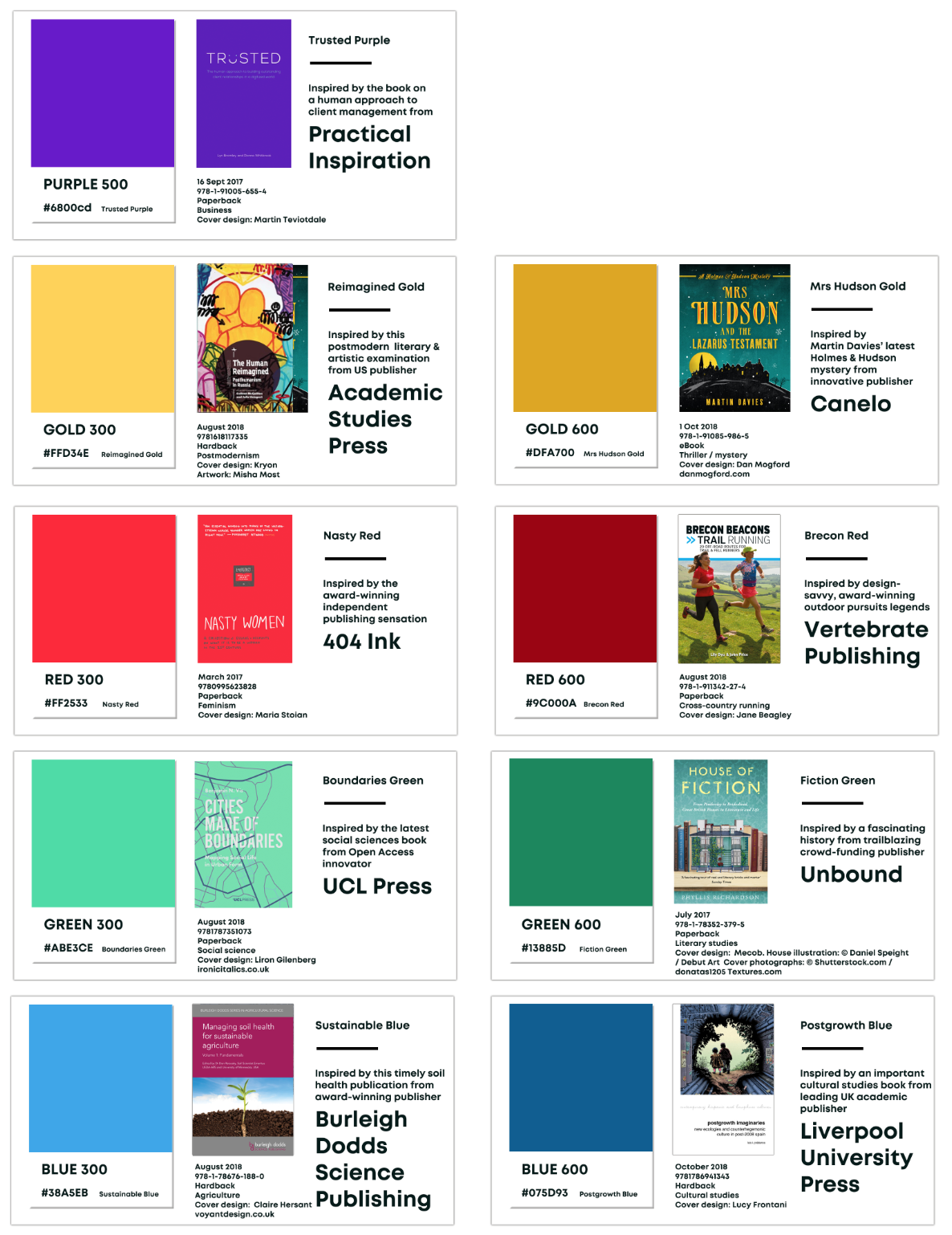
The checks page show some of the colours, hard at work: Nasty Red from 404 Ink, Boundaries Green from UCL Press, and Reimagined Gold from Academic Studies Press. All 48 accessible colours are presented in our style guide.
Unbranding
In all, the process of realising our position as a teacher and enabler, and the feedback from our customers which prove that we’re achieving our goals, gave us the confidence, ironically for a branding exercise, to mute any brashness or attention-grabbing. Our voice is secondary to the bigger aim of getting knowledge and insight into our customers’ hands.
So gone is the sweet shop candy-coloured old interface, and fuzzy messaging, in favour of the papery, quiet tones and solid, deep expressions of expertise that allow customer results and insights to take centre stage. And gone is any mention in the UI of our brand. Instead, we have created high-quality SVGs of each of our clients’ logos, which sit proudly on their sidebar. It’s our clients’ space, not ours.
Rather than rebranding we have, to some degree, unbranded. Our success is, after all, our customers’ success. So read our thoughtful, informed writing about the publishing supply chain and data standards. Absorb our in-depth, opinionated, experience-based advice. Learn from our clients’ successes in our case studies. Notice the insights our customers get from their use of the system. And draw your own conclusions about our brand from the evidence.
This post is part of our branding series:
Are your current systems sabotaging your growth ambitions? Are you hungry to implement new business models, but concerned you lack the strong administrative foundations needed for innovation?
We're always amazed at how resigned publishers have had to become to the low bar in publishing management systems. Demand more.
Contact us via our contact form, or email us.