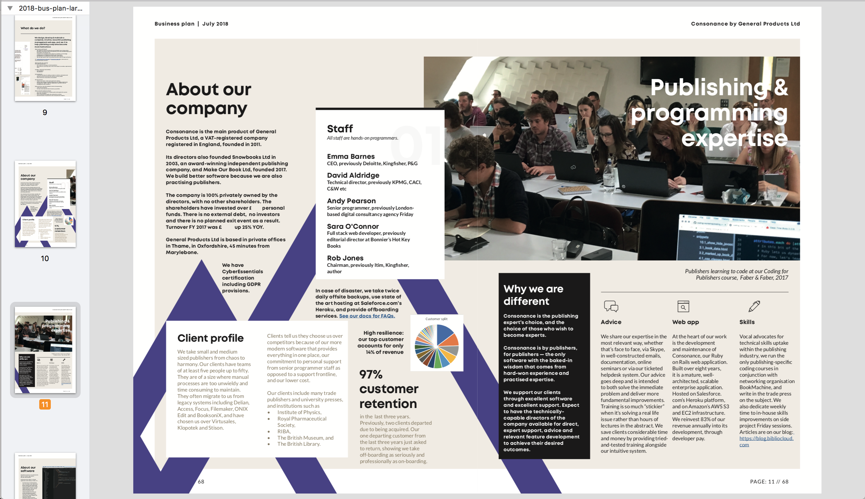
In early 2011, our CEO Emma Barnes sat at the kitchen table and wrote the first lines of Ruby code for Bibliocloud, a system created to manage her publishing company Snowbooks’s data efficiently, so she could ditch the drudge and focus on publishing creatively.
The idea was always to build a system both beautiful and functional: a system where you wanted to spend the best part of your day; a system which provided you with everything you need to run the business, smoothly and intuitively. A system whose design was so good, it gave you what you needed and got out of the way, so you could get on with publishing.
Seven years later, what started as an in-house dream is now a fully-fledged, mature software business staffed by publishing and technical experts, with a wide range of professional, academic, scholarly and trade publisher clients around the world sharing in that original vision.
We deliver a lot of value, and we have always done that with some style. But despite clients a year ago telling us that they liked the clean design of the software, which was vaguely based on Google’s Material Design, we knew that we could do a lot better, in particular on consistency. Consistent design, across all communications, whether that’s through software or not, removes a layer of mental effort.

To achieve coherence and consistency, we had to formulate a look and feel across a number of different elements. Here follows a list of those elements, designed to complement each other and work to form something greater than the sum of their parts.
Product name
The name Bibliocloud
has felt generic and over-literal for a while. Lots of software includes the word biblio
in their name. And cloud
is hardly a noteworthy feature nowadays: calling attention to it feels embarrassingly early ‘00s.
We chose Consonance
for its lyricism, its literary connotations and its meaning: harmony, agreement and compatibility.
Our intention with the software is to bring harmony and smoothness to our customers’ data and workflows. Consonance
reflects that beautifully.
Font
The font is from the Mont family: Bold with optical kerning for the light logo, with Semi Bold used with a 0.5pt stroke and manual kerning for the dark logo to counter the irradiation illusion.

We chose this font for its symmetry, consonance
between letter forms, its simplicity and boldness. We use this font elsewhere in applications of our identity, such as the website.
Logomark
The logomark is an upward trending line, built with that icon of stability, the triangle, made up of many smaller triangles. It speaks to the importance of team effort and solid infrastructural underpinning. It says that we are a trusted partner, who provides the building blocks of publishing capability.
The Gestalt principle of closure also serves to reveal the hidden triangles within the mark, made in whitespace.
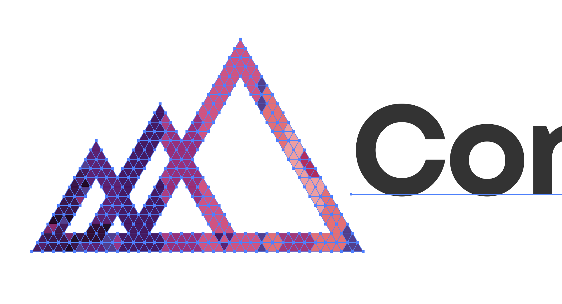
Further triangles are revealed from the text alignment guides.
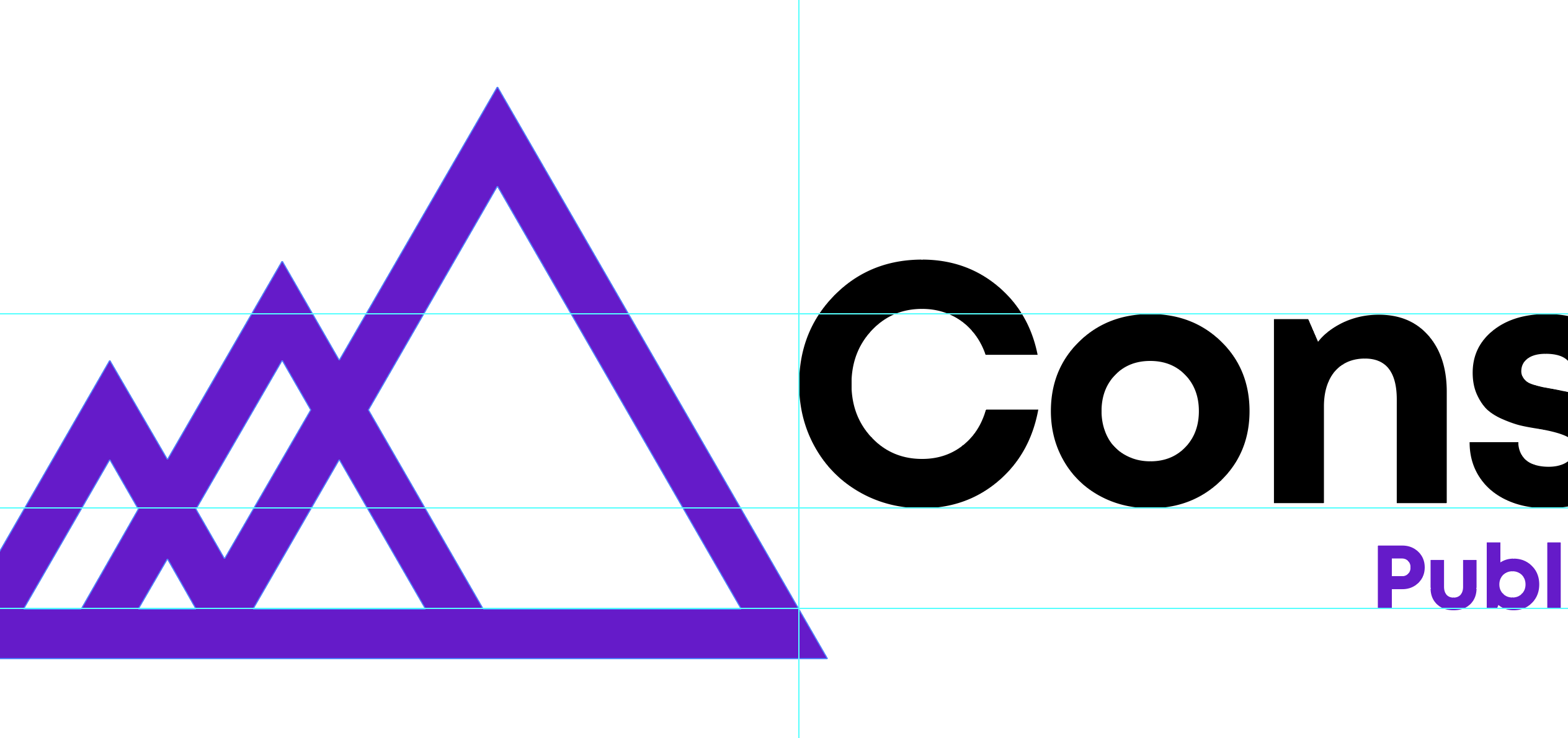
The mark is, in all, the essence of stability and growth.
Variations
There are a number of variations to the logo, including a lock-up with a descriptive strapline.

Colour
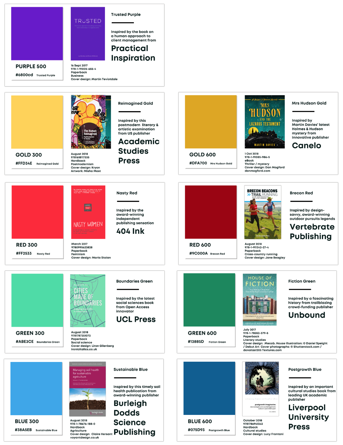
The logomark purple is our brand colour: Trusted Purple, taken from our new colour palette. The key primary and secondary colours are named after some of our clients’ most striking book cover designs. The style guide contains all 48 colours.
Applications
We’ve designed all the components of our identity – font, colours, primitive triangle shapes, the name and the logomark – to be malleable and put to work across a range of media, both now and in the future.
Among the most important application, of course, is in our software. The rebrand included designing new navigation and implementing the new colour palette, for a knocked-back, papery, quiet feel that lets clients’ data shine.
The checks feature embodies our message of expertise, providing insights into your data in rich ways to guide you towards selling more books.

In conclusion
This eight-month-long in-house project has resulted in a strategic, coherent, flexible identity that communicates our core messages of expertise and stability, within our software and beyond. And, without doubt, it’s also a way to celebrate and showcase the effort we put into our development process. Yes, Consonance is a back-end admin app. But why shouldn’t business software be beautiful? Our customers have to live in their software for their entire working day. It’s unacceptable that such a large part of your working life should be spent mentally unpicking confused interfaces and workflows. So it’s our own working life’s work to make yours better.
This post is part of our branding series:
Are your current systems sabotaging your growth ambitions? Are you hungry to implement new business models, but concerned you lack the strong administrative foundations needed for innovation?
We're always amazed at how resigned publishers have had to become to the low bar in publishing management systems. Demand more.
Contact us via our contact form, or email us.