Everyone in our team is a programmer. But we also cover all the other business functions between us, such as sales, design, and customer success, so we like to think that we combine the best of both worlds: deep technical knowledge as well as business savvy.
And so in both Consonance’s UI and our communications, we’ve been working to provide a coherent, consistent experience to people, whether they’re a current or prospective user of Consonance. As well as the logo and other design elements, we want the Consonance UI itself to project our promise:
to harmonise publishing businesses’ processes, by sharing our expertise through our app and all our communication, so our customers sell more books with less effort.
To do that, we needed to revise the navigation. This was because:
- The navigation appears on every page but its code was slow to run – making every page slower than it could be.
- The design of the navigation was odd: a fairly standard bar down the side for the global nav, but then a bar along the top, intersected by another local bar, with dropdowns. This was not an extensible pattern, and caused some user confusion and unpleasant visual tension.
- The palette of the navigation was a rather alarming coral red, which users told us was off-putting. Red for danger!
We needed to provide a solid foundation for all the development we want to do in the future:
- To have code that ran quickly
- To be able to extend the code in ways we couldn’t yet imagine. This is at the heart of object-oriented programming: our code needed to be revisable. The first chapter of Sandi Metz’s Practical Object-Oriented Design is inspirational on this topic.
Planning the navigation project
We ran three 6-week pieces of work to redesign our navigation, two in parallel. Inspired by Basecamp, this year we’ve adopted the approach of working in 6-week blocks. It’s a great way of keeping scope tight on a project, and keeping momentum going. Having delivered three huge projects using this method this year – the navigation, the home dashboard plus grid implementation, and our data checks functionality – we are completely sold on it being the right way for us to work, to deliver value, quickly, and to help us plan and execute our work in a productive, low-fuss way that we trust.
At first, we thought the work would fit into one 6-week block, but the beauty of the approach is that we can re-scope as we go along.
The kick-off meeting took an initial stab at the scope, and laid out our objectives (which were informed by user feedback from our annual survey, and individual tickets and conversations with users), but avoided big design up front:
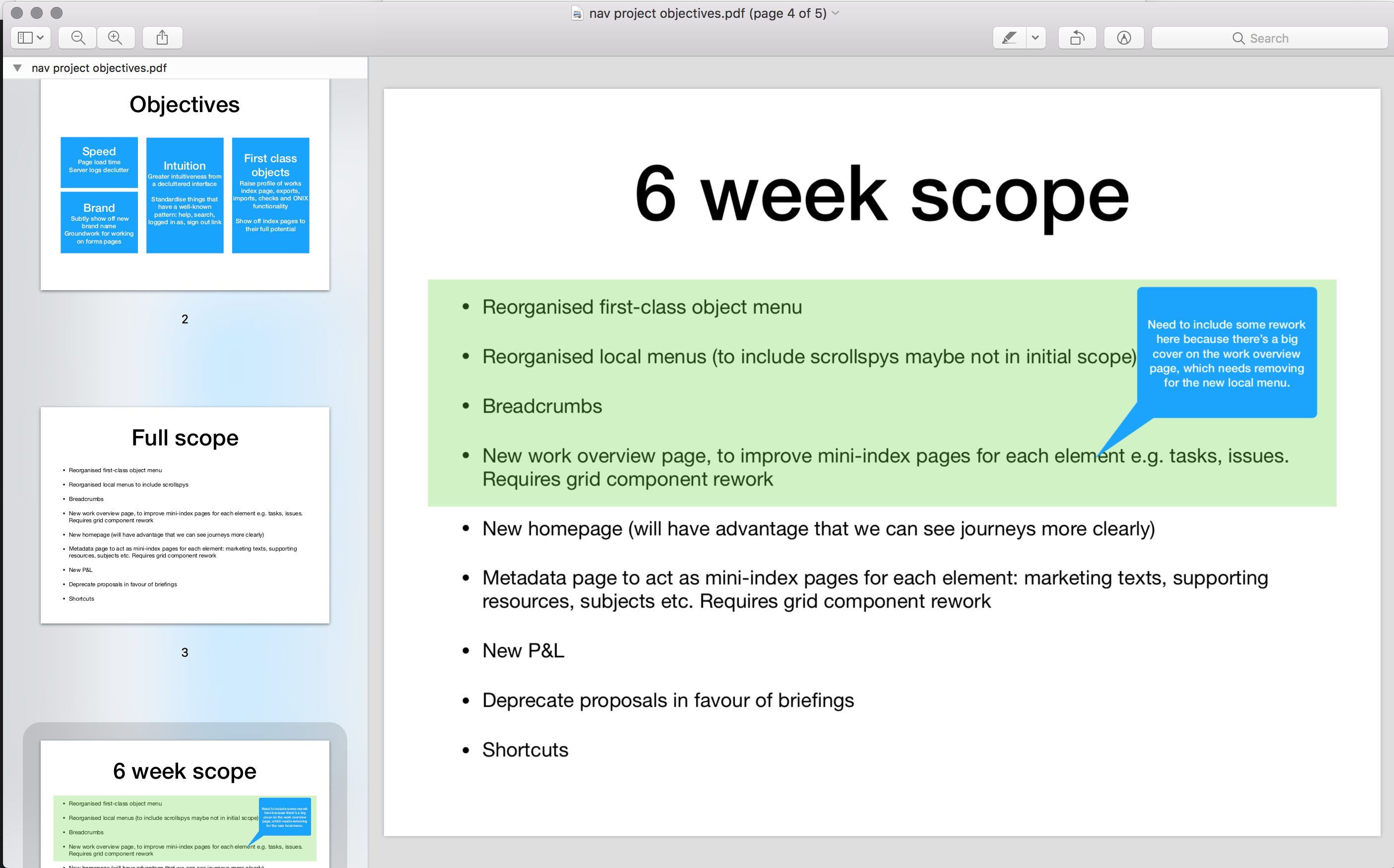
The project ended up being as follows (with the main person doing the work in brackets, with discussions between us all at our daily meeting):
Pre-work:
- Deciding the technical approach. React? Pure Rails? Stimulus? Turbolinks? An off-the-shelf component such as Atlassian’s? (Andy)
- Planning the links themselves and the terminology to be used (Emma)
First 6-week block:
- The creation of the React component, and its implementation for the global sidebar (Andy)
- The design of the page header (Andy)
Second 6-week block:
- The refactor of the component, so it could be re-used for the local sidebar (Andy)
- The breadcrumb and header code (Andy)
- New pages required including an exports page and revised work and contact pages (Andy)
- The implementation of the global nav, page header, breadcrumb and local nav (Emma)
Parallel 6-week block:
- the home dashboard and rework of index pages made more visible by the new nav (Sara)
The planning stage falls outside of the 6-week cycle. In fact, it’s fair to say that our thinking about the new navigation has been ongoing for a number of years, although we started planning in earnest on this project around February 2018. We’d done some preparatory work, such as the
removal of legacy bookmarks functionality in favour of using browser bookmarks, and we’d started to think through solutions for managing both global and local navigation. Here, for example, is an early Adobe XD mock up, inspired by
Atlassian’s navigation component (the password is V8kUZKTT). Mock ups like this showed us the benefits and flaws of each approach we considered, and let us prototype ideas quickly. We also employed spike
branches of code to good effect in this and other projects – creating throwaway code that let us rough out an approach
without worrying about test coverage or code quality whilst we’re still at the dibbling stage. Some code survives these spikes, but the idea is that anything goes, to encourage creativity.
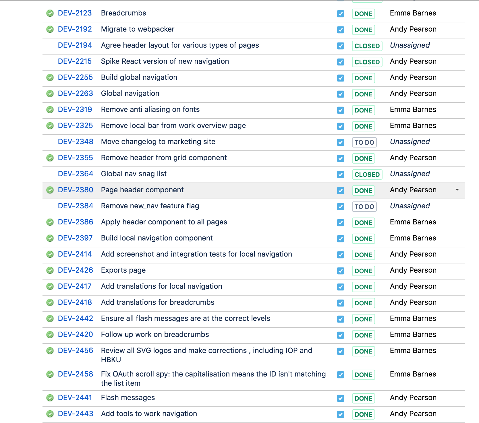
Here are some of the tickets on the JIRA epic that we used to manage the detailed work of this project.
Side projects
Another aspect of our work which had a huge effect on our ability to undertake this ambitious project was our practice of Friday afternoon side projects. Senior programmer Andy deepened his understanding of React by embarking on his own very ambitious side project: miniatures painting recipe app Paint Pad. His project enabled him to spend meaningful amounts of time delving deep into how React can work, and provided assurance and proof that we could use it on Consonance. We are huge fans of side projects as a safe, motivational way to try out new technologies on the job.
Programming
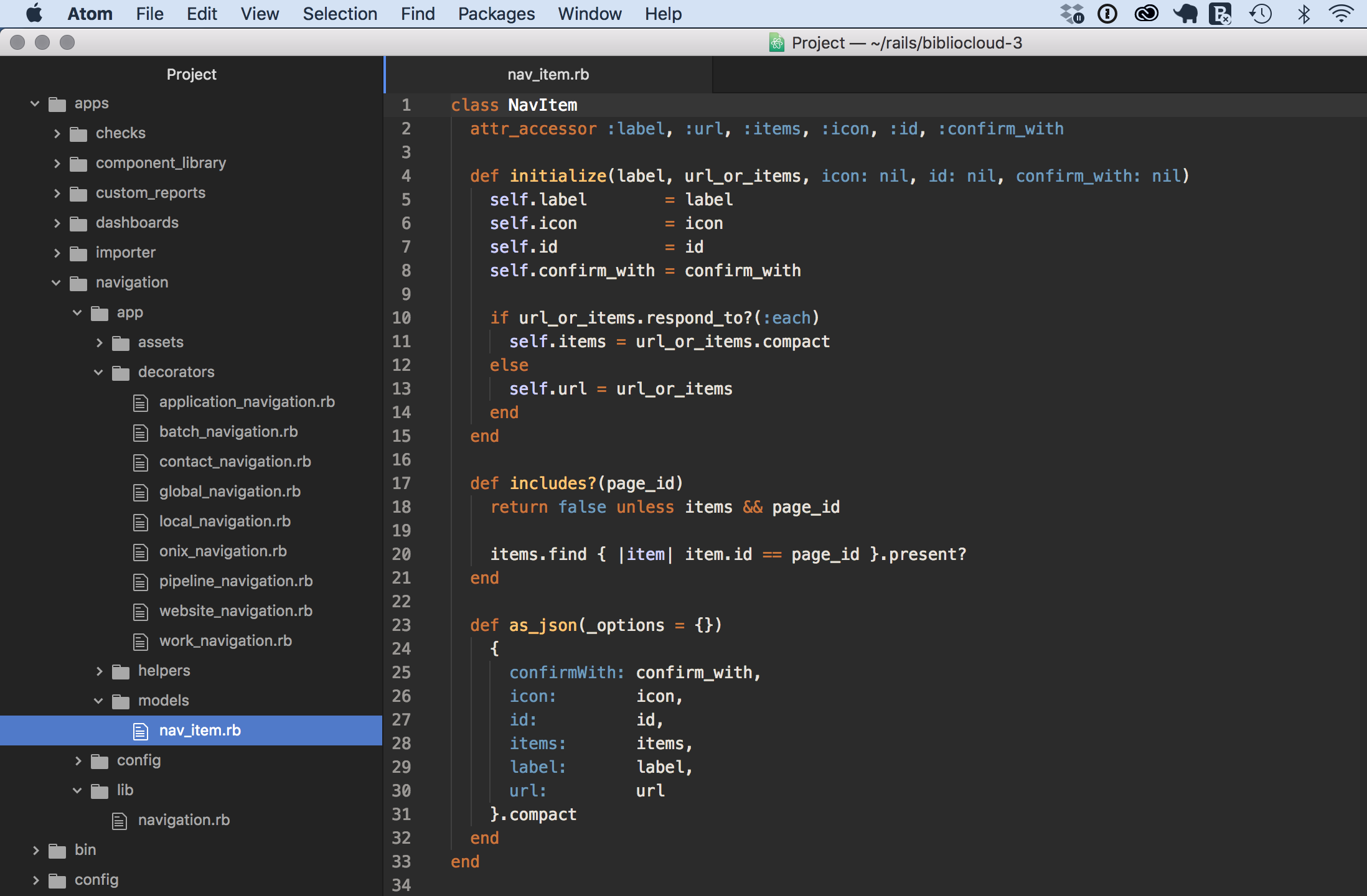
The planning stages gave us enough insight to allow us to decide to roll our own React component, and to write it as an engine.
Here it is, sitting alongside some other engines (checks, dashboards, and our importers, for example). This keeps the code nicely organised, and easier to work on in the future, rather than dotting around every corner of our monolith to find all the relevant code.
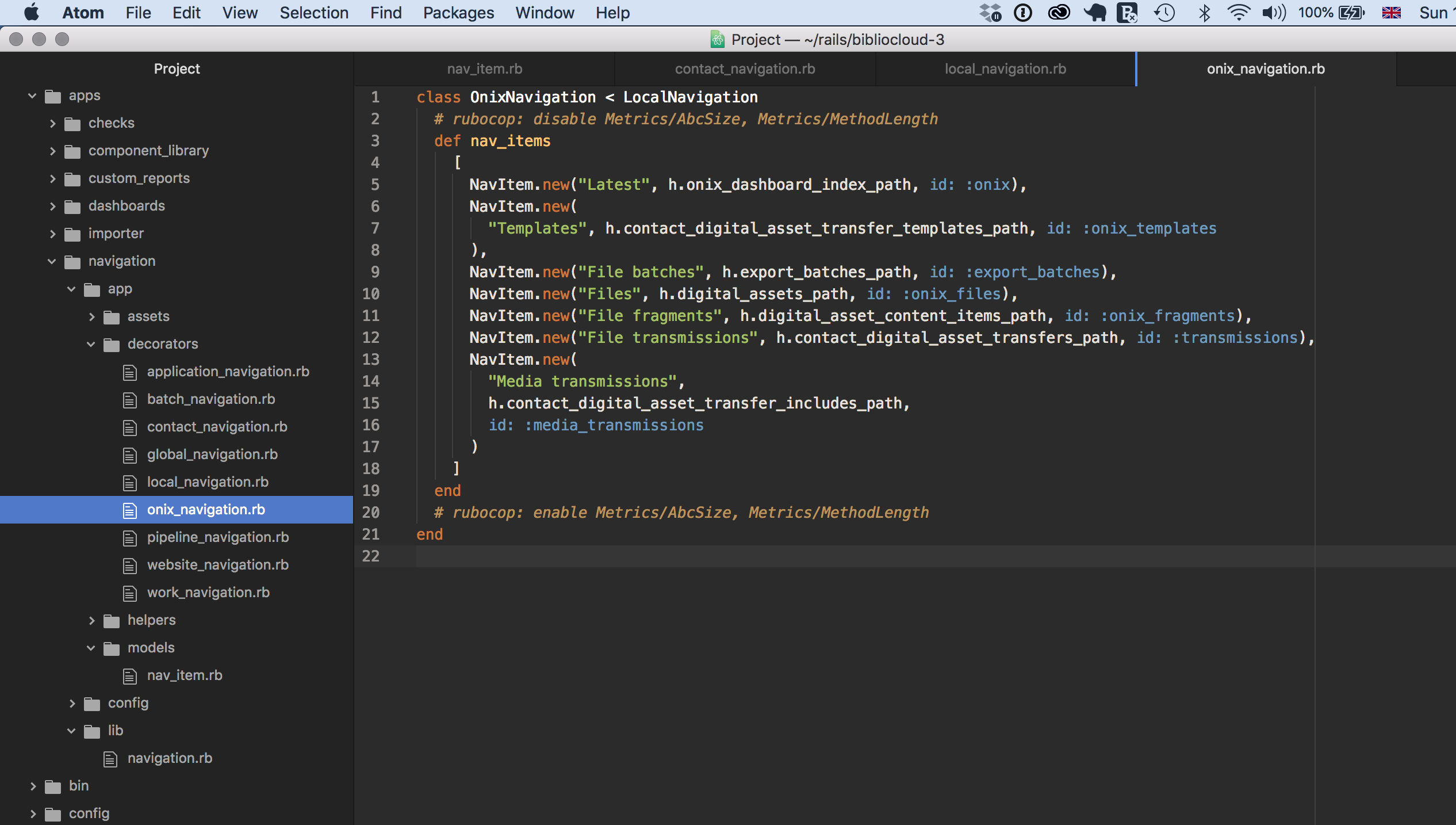
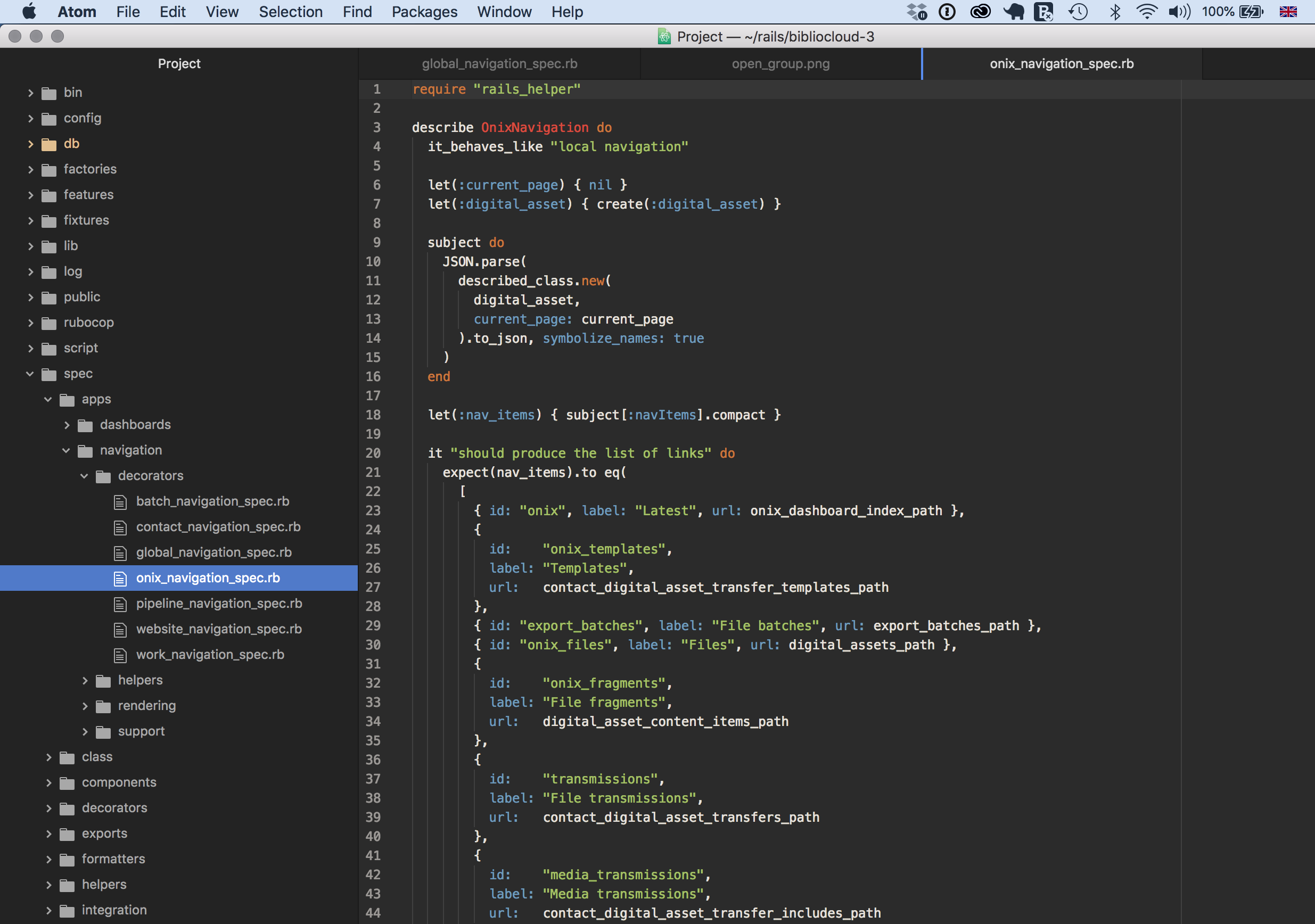
Here’s one of the files for the ONIX area. It’s known as a decorator, because it takes raw data and decorates it to make it presentable for appearing in the UI. You can see RuboCop — our automated code-quality evaluator — complaining about the length and the ABC size of the method: perhaps we’ll refactor that in the future.
We were particularly pleased to be able to write a React component that could have multiple instances: both the global and the local sidebar are instances of the same component.
Testing
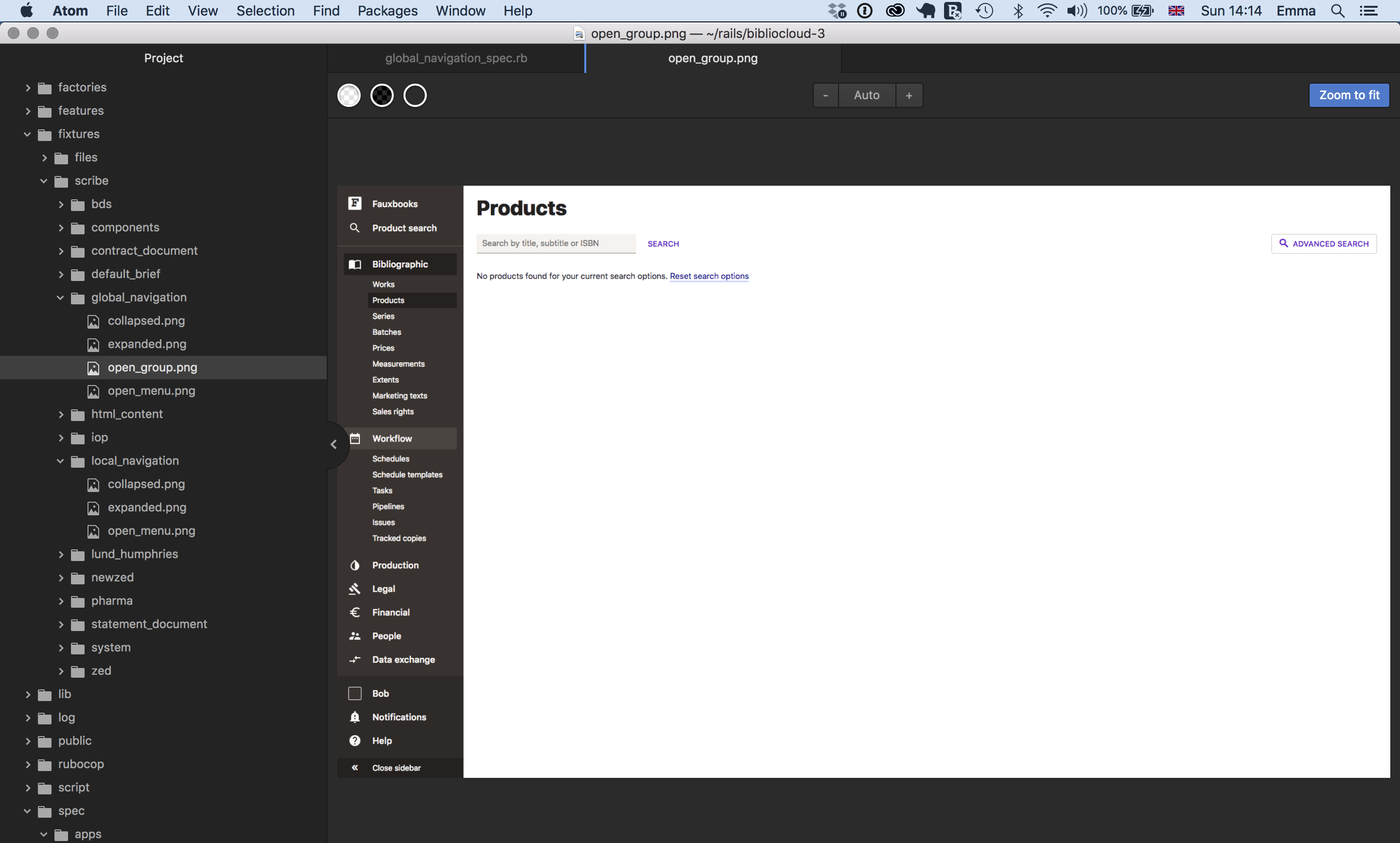
The navigation feature has unit and integration tests. Here is an integration test to check that the global nav appears as expected:
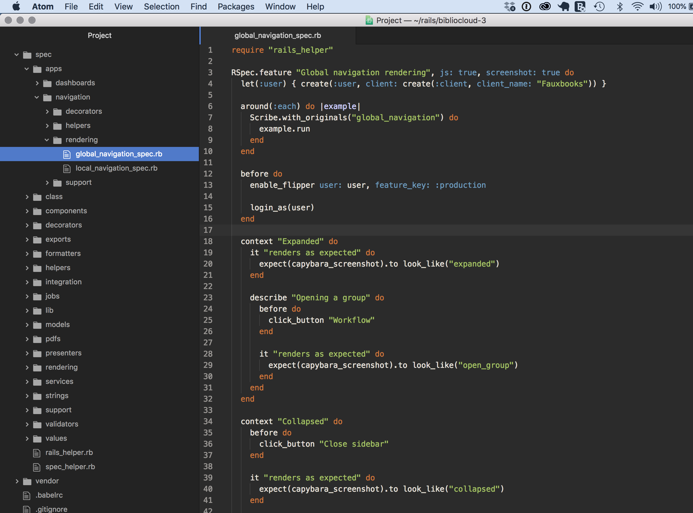
Here is the fixture — or previously saved file — that is used as a comparison, when the test on line 28 runs. Imagine the test runs and draws its output on tracing paper. The test overlays the tracing paper version on the fixture version. If all the pixels line up, the test passes. If not, the test fails and we know we need to fix the code before deploying it.
Here’s an example of a unit test for that ONIX decorator.
Implementation
The rollout of the new nav was quite laborious. Each view in the app (there are over 500) needed the addition of:
- The breadcrumb
- The current page
- The appropriate local nav
- The appropriate header
And we made CSS changes on:
- Links
- Buttons
- Fonts
- Search bar
- Colours
The difficulty was compounded by wanting to avoiding having a long-running feature branch, with a frightening big go live
at the end. Instead, we wanted to be able to
merge the new code into our main branch as we went. This problem was solved with the marvellous Flipper which meant we could allow beta users to access the feature before it was made fully live, allowing us to take on board feedback in a timely fashion.
After the final feature was presented to clients and had a favourable reception, we stripped out the flipper code and all the original nav code too, which removed many hundreds of lines of legacy code.
We shipped the new nav two weeks before the main Consonance rebrand announcement, to decouple the implementation of this major new feature from the hullaballoo of the actual rename.
Website
As well as the major navigation project in Consonance itself, the marketing website, which you’re reading now, has had an overhaul. It is a Middleman app, a static site generator which allows us to write in Markdown and HTML. The styling uses CSS grid, with fallbacks for older browsers provided by Modernizr. It uses SVG graphics for crispness, and our new brand colours and fonts. It has been pleasing to migrate all our documentation data from a third party to easily-maintained Markdown files, and to write a complete style guide.
Roll out
The third major technical aspect of the rebrand was the change of domain name and emails. This required a lot of project planning, considering:
- API calls to Consonance
- References to the old bibliocloud.com emails
- Heroku custom domains
- FTP locations
- Social media handle updates
- AWS configuration
- Other third party integrations
- DNS updates
- Clear communication to all relevant players
Summary
The rebrand has been a fantastic opportunity to address the long-running desire we’ve had to improve the intuitiveness and code quality of the navigation, and we’re really pleased it’s been such a technical success and so well received by our customers. And it lays the foundations beautifully for all the exciting developments we have planned on our roadmap. We feel that the way we conducted the project was also in line with our values of harmony and expertise, modernity and customer success, which we’re really proud of.
This post is part of our branding series:
Are your current systems sabotaging your growth ambitions? Are you hungry to implement new business models, but concerned you lack the strong administrative foundations needed for innovation?
We're always amazed at how resigned publishers have had to become to the low bar in publishing management systems. Demand more.
Contact us via our contact form, or email us.